top of page

Kura Tāwhiti – Canterbury Community Foundation
For good,
forever.
Who We Are

We are the Community Foundation for Christchurch City and the Selwyn and Waimakariri Districts.
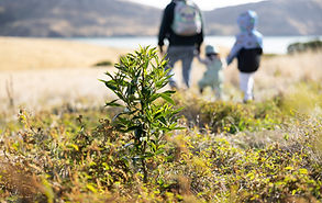
Kura Tāwhiti – Canterbury Community Foundation is committed to helping create a thriving and resilient community.
Community Foundations take a long-term, community-based view of giving and impact.
The smarter giving model of charitable Community Foundations ensures these gifts have the maximum impact now and into the future.
Three Pillars of Giving

.jpg)
.jpg)

Philanthropy
is not just for those with great means, it's for those who mean to do great.

The Christchurch and adjacent communities you love will benefit from your generosity...
Now &
forever


bottom of page